One word, two capitals
It is “HyperOrbit”. Not Hyperorbit, not Hyper Orbit, not HYPERORBIT outside a mono kicker. The agents are Chorus, Recon and Atlas, always named, never “the AI”.
Wordmark on light, wordmark on dark, and the mark
 Gradient wordmark · light backgrounds
 White wordmark · dark scene
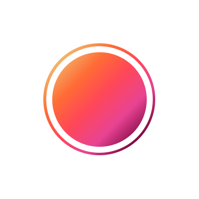
 The mark · app icons, favicons, avatars

Give it room, and never go below the minimum
Clear space = the height of the O
Keep at least one O-height of empty space on every side of the wordmark. Nothing sits inside it: no text, no other logos, no edges.
Wordmark minimum on screen
Below this the gradient and the letterforms lose definition. In print, 34 px equivalent, about 12 mm.
Mark minimum
The mark on its own holds up to 20 px. Use it for avatars, app icons and anywhere the full wordmark would not fit.
Favicon
The mark drawn for 14–16 px. Use the supplied favicon files rather than scaling the large mark down.
Warm neutrals, one hot gradient
Every neutral is a brown, never a cool grey. The orange-to-pink gradient is reserved for the mark, primary buttons and the single number that matters most on a surface.
Two families, one voice
Fraunces Medium
H1 and H2 only, weight 500, tracking −0.02em and −0.01em, always sentence case.
IBM Plex Sans 400
Body copy at 13–16px with 1.55–1.7 line-height and no tracking. H3 and card titles in SemiBold 600.
IBM Plex Sans 500
Buttons, navigation, labels, counts and timestamps in Medium 500. Never a third typeface.
Six things that stop it looking like HyperOrbit
Need something that is not here?
Co-marketing lockups, a partner badge or a screenshot pack: write to us and we will send it the same day.